Driving product-led growth through user onboarding
Web, UX / UI Design
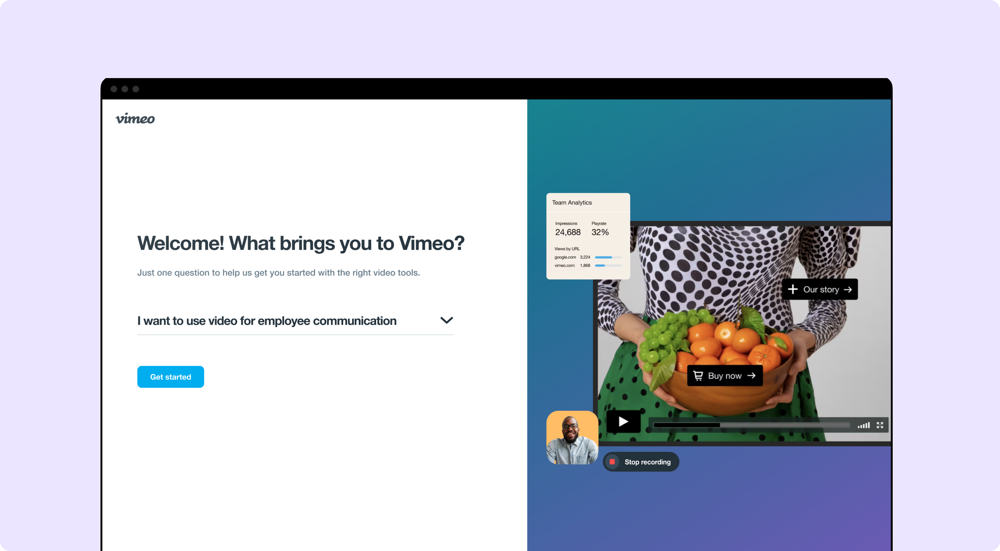
Overview
In 2022, Vimeo set out an annual objective to drive Product-Led Growth and exceed 100% in Net Revenue Retention. As Vimeo pivoted its product offering into an all-in-one video solution for enterprises, Vimeo identified a unique opportunity to deliver a diverse range of video tools to address the JTBD within three new market segments.
As the Product Design Lead on the onboarding team, I was responsible for creating a design strategy for user onboarding across all video tools. This project walks through my process for identifying areas of opportunity, re-designing the onboarding experience, and advocating for buy-in from stakeholders.
I partnered with multiple teams across the company including business insights, the VP of Product and product management, product marketing, engineering, UX research, and content design.
MY ROLE
Product Design Lead
DURATION
Jan - May 2022
IMPACT
Drive Product-Led Growth, exceed 100% in
Net Revenue Retention
THE PROBLEM
Vimeo found that 66% of all new users who signed up for a free trial don’t upgrade to a paid subscription and often abandon the product after using it once. Out of the remaining new users that did return, only 5% understood the value of Vimeo’s product offering in solving their job to be done.
THE DESIGN CHALLENGE
THE solution
How might we showcase the value of Vimeo’s video solutions in solving the JTBD within our new market segments, thereby exceeding 100% in Net Revenue Retention?
Build a personalized user-onboarding experience to help users within our new market segments understand the value of Vimeo’s video tools in solving their job to be done, and turn these users into lifelong customers.
The design process
understanding the context
Evaluating key business metrics
As a first step in this design challenge, I partnered with our business analytics and product marketing team to understand key business metrics that we wanted to improve through user onboarding. Understanding retention and conversion rates allowed us to strengthen our case for improving the experience at the top of the funnel. Using Amplitude.com, we evaluated the following metrics →
Key metrics:
1. Conversion rate: 0.5%
2. % of retention: 33.2%
3. % of users skipped onboarding survey: 72%
4. Onboarding completion rate: 12%
5. Engagement rate on product homepage: 0.4%
6. NPS: 7
7: CSAT: 53%
understanding the context
Our new audience and their JTBD
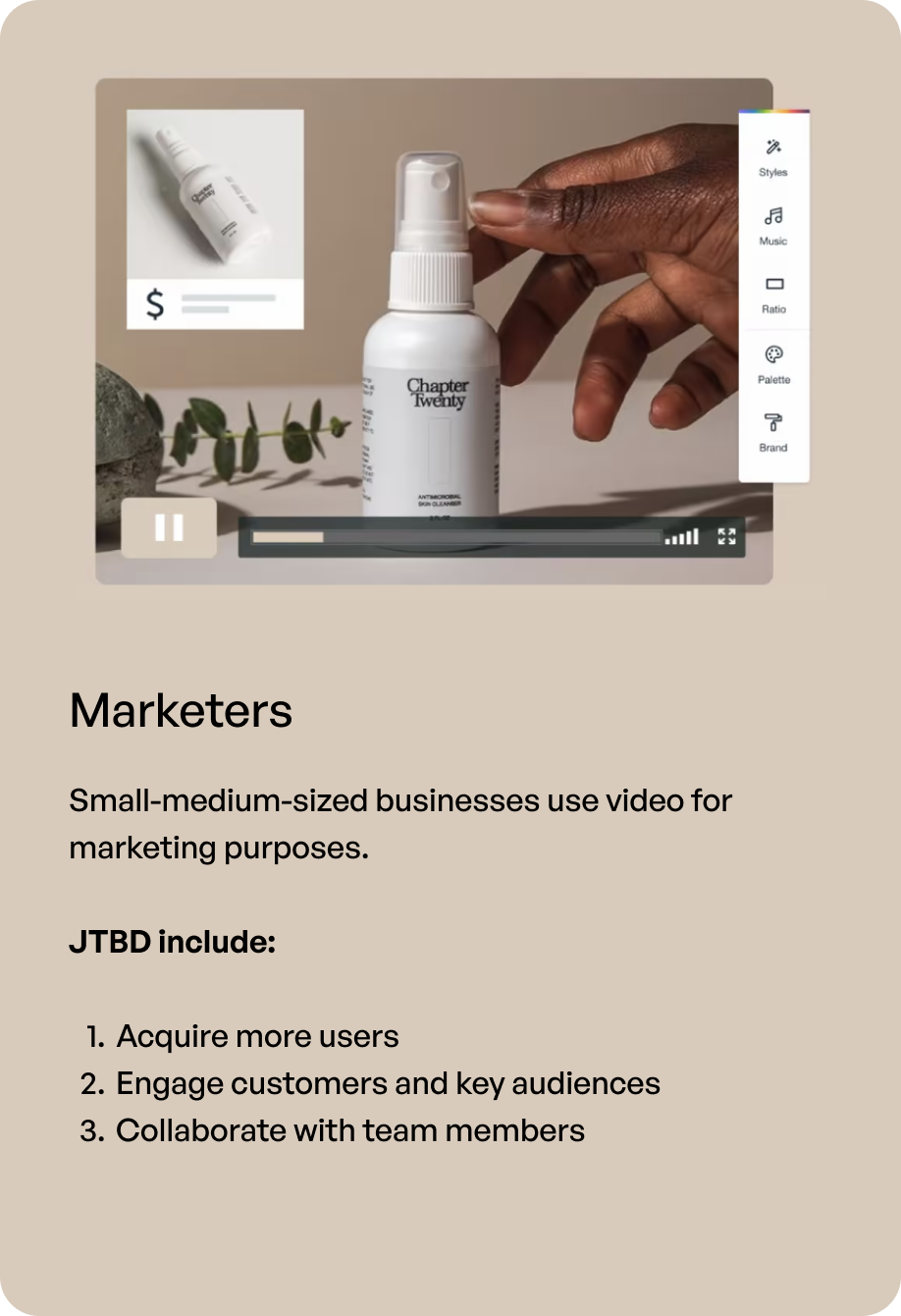
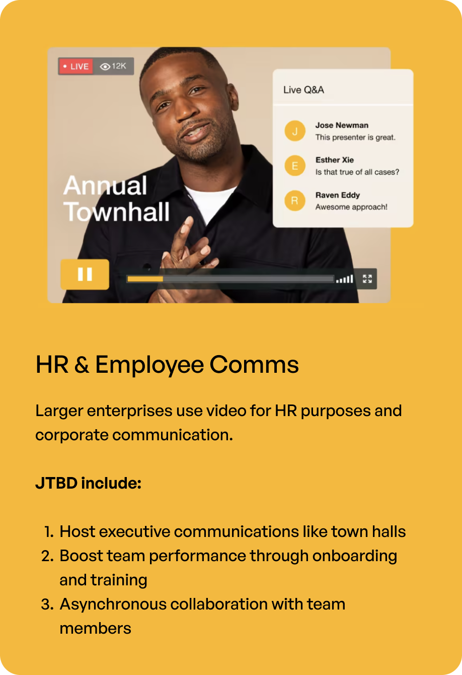
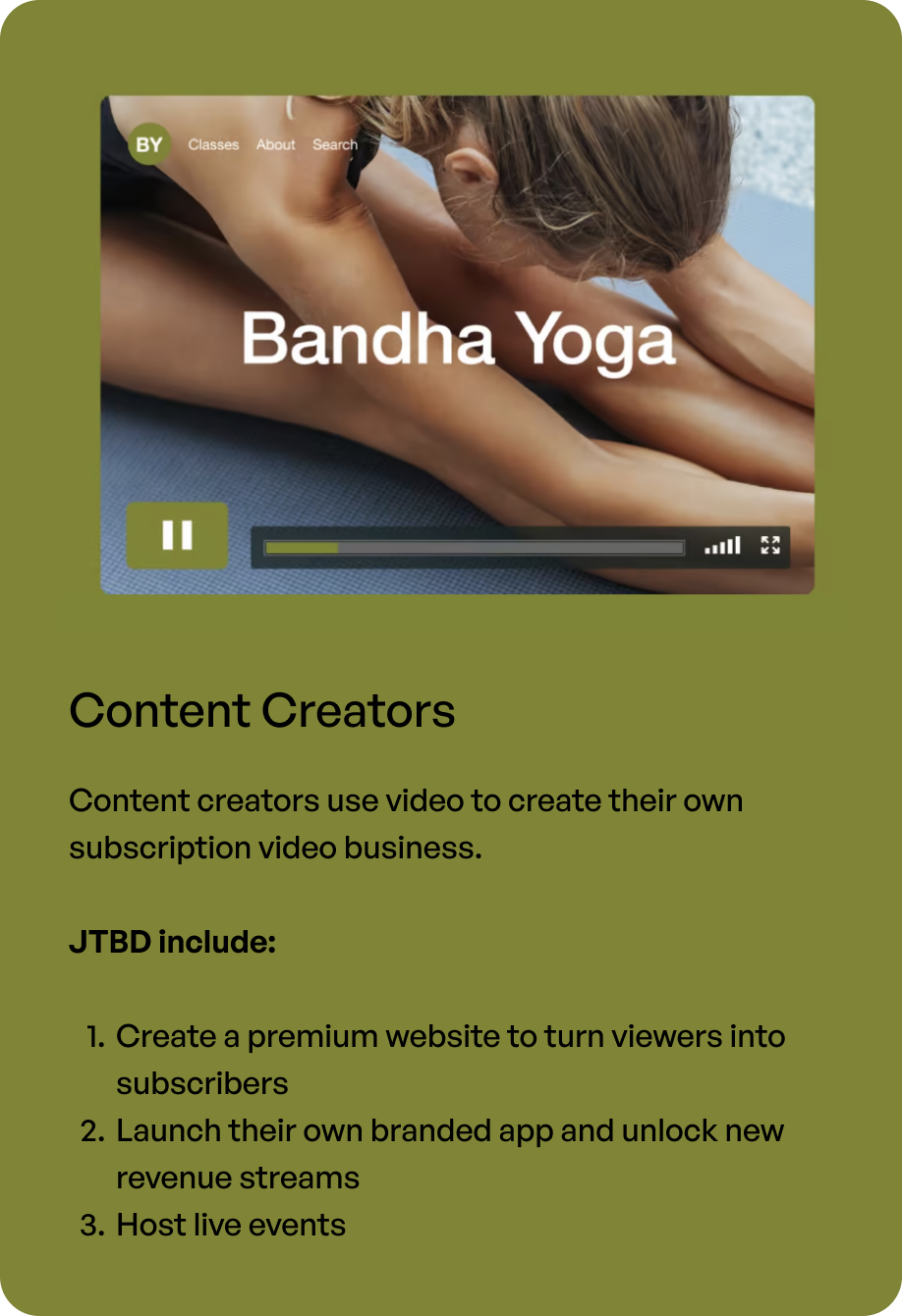
In partnership with UX research and product marketing teams, I did a deep dive into understanding our new audience, their job to be done, and how Vimeo positions its video tools to solve these needs.
understanding the context
Mapping the existing landscape of user onboarding
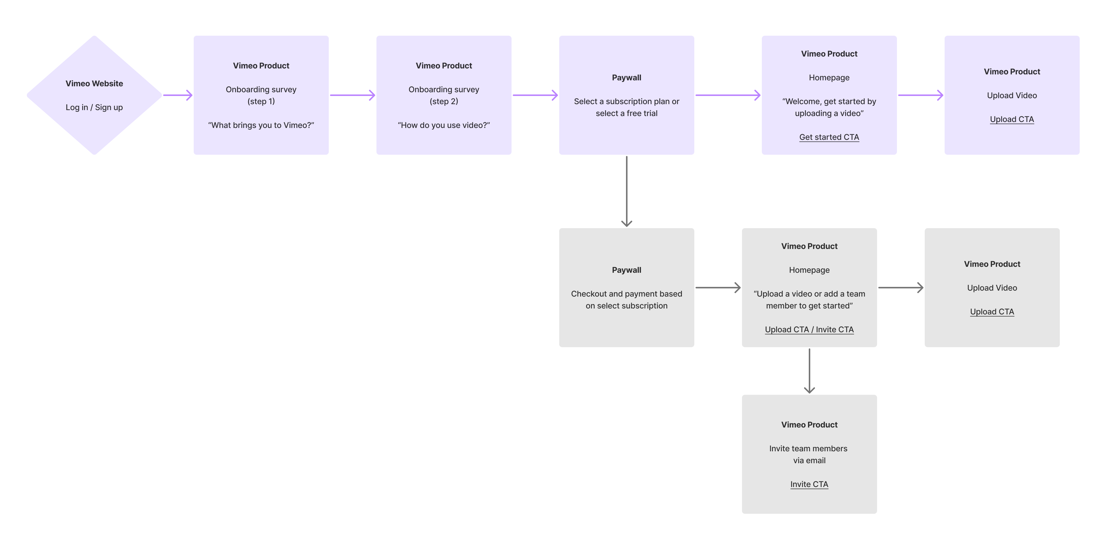
To understand the landscape of our current onboarding experience, I conducted an audit of all entry points into Vimeo based on each tier plan. Leading through questions allowed me to identify gaps in the current experience, and propose opportunities for improvement. The goal was to identify potential ‘aha’ moments and how we could maximize on providing immediate value to users coming into Vimeo, and keep them engaged enough to complete onboarding.
Old onboarding user journey
Identifying gaps and areas of opportunities:
- Vimeo’s onboarding survey didn’t lead to personalized recommendations
- When users landed on the homepage, they were prompted to upload a video — doesn’t account for users’ JTBD, and doesn’t showcase Vimeo’s various video tools
- Pay-wall right after onboarding survey significantly increased drop-off rate
- Once users land on Vimeo’s homepage, there was no guidance on relevant features to get started with
IDEATION
Defining successful onboarding practices
- External research
- Competitor analysis: As a first step within ideation, I conducted external research to understand best practices for successful user onboarding. I read case studies on Growth.design and Ramli John‘s guide to Product-Led Onboarding which lay the foundation for the rest of this project. I mapped out a competitor analysis, evaluating the pro’s and con’s of each approach and outlined useful tactics relevant for Vimeo’s onboarding.
- Defining success metrics

Challenge
A key challenge was having limited resources, so we were constantly breaking down a complex problem into smaller achievable solutions. We narrowed down our scope to focus on delivering value within the personalized onboarding survey and product homepage. We defined our metrics of success as increasing the survey completion rate and engagement rate on the homepage.
User Psychology & 'Aha' Moments
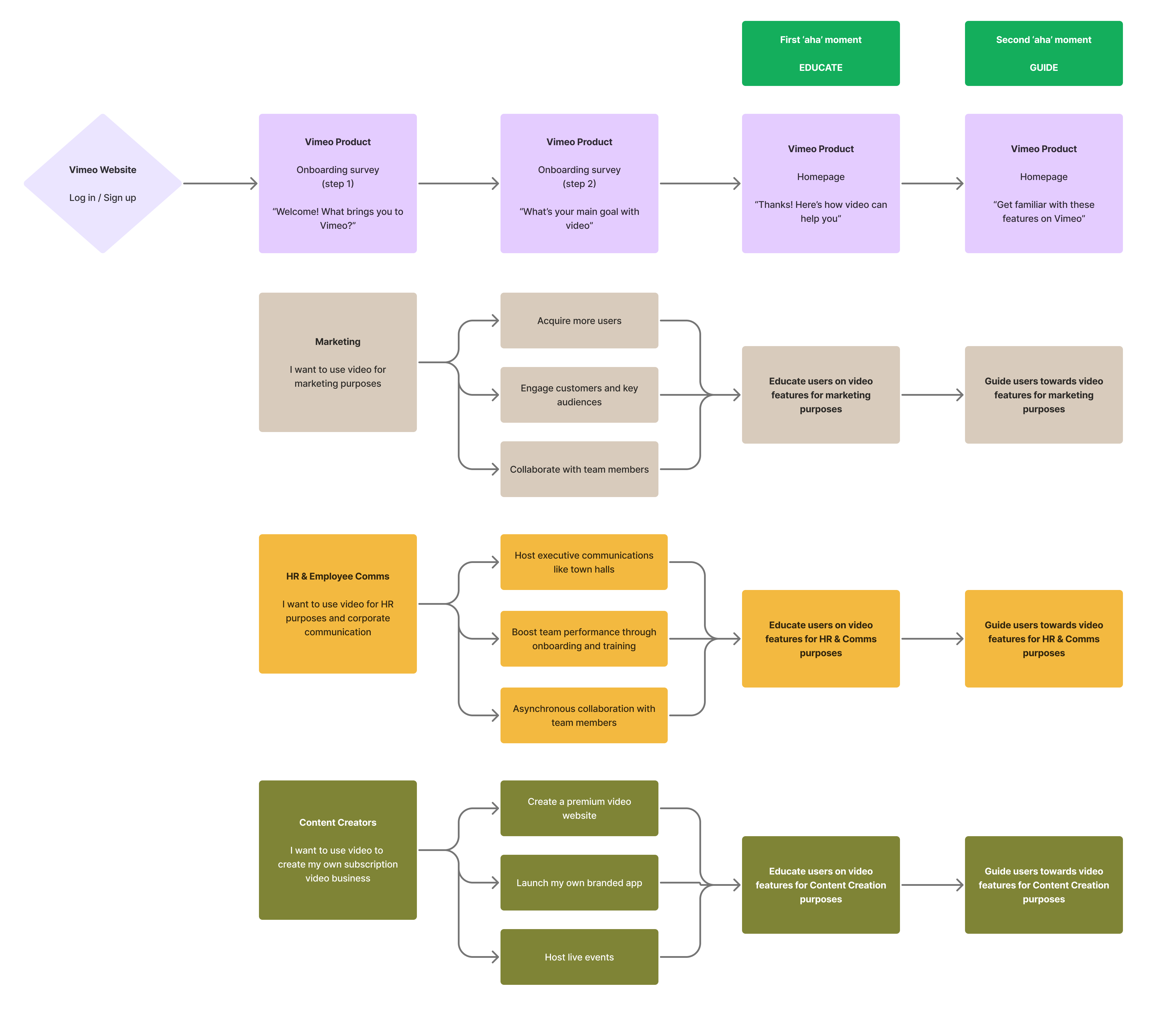
I began by outlining the ideal onboarding user journey and key ‘aha’ moments that would continuously keep users engaged. The goal was to tailor the user onboarding for each user’s job and highlight the right features at the right time, giving users the tools to execute each specific job. The first aha moment was after a user enters their information, they are presented with a value proposition based on their response. The second aha moment was highlighting features specific to that job.
New user onboarding journey
Solution hypotheses
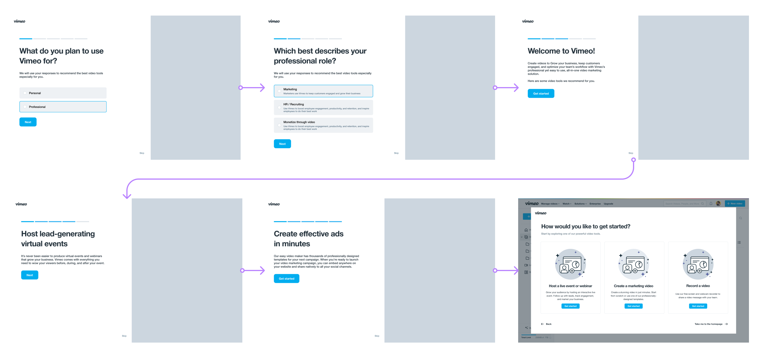
I translated this user journey into multiple low-fidelity wireframes highlighting various approaches to delivering value. A few aspects that were explored were the level of engineering effort, the level of personalization, and the number of steps invovled.
Wireframe #1: One page survey → video feature highlight → feature guided tour
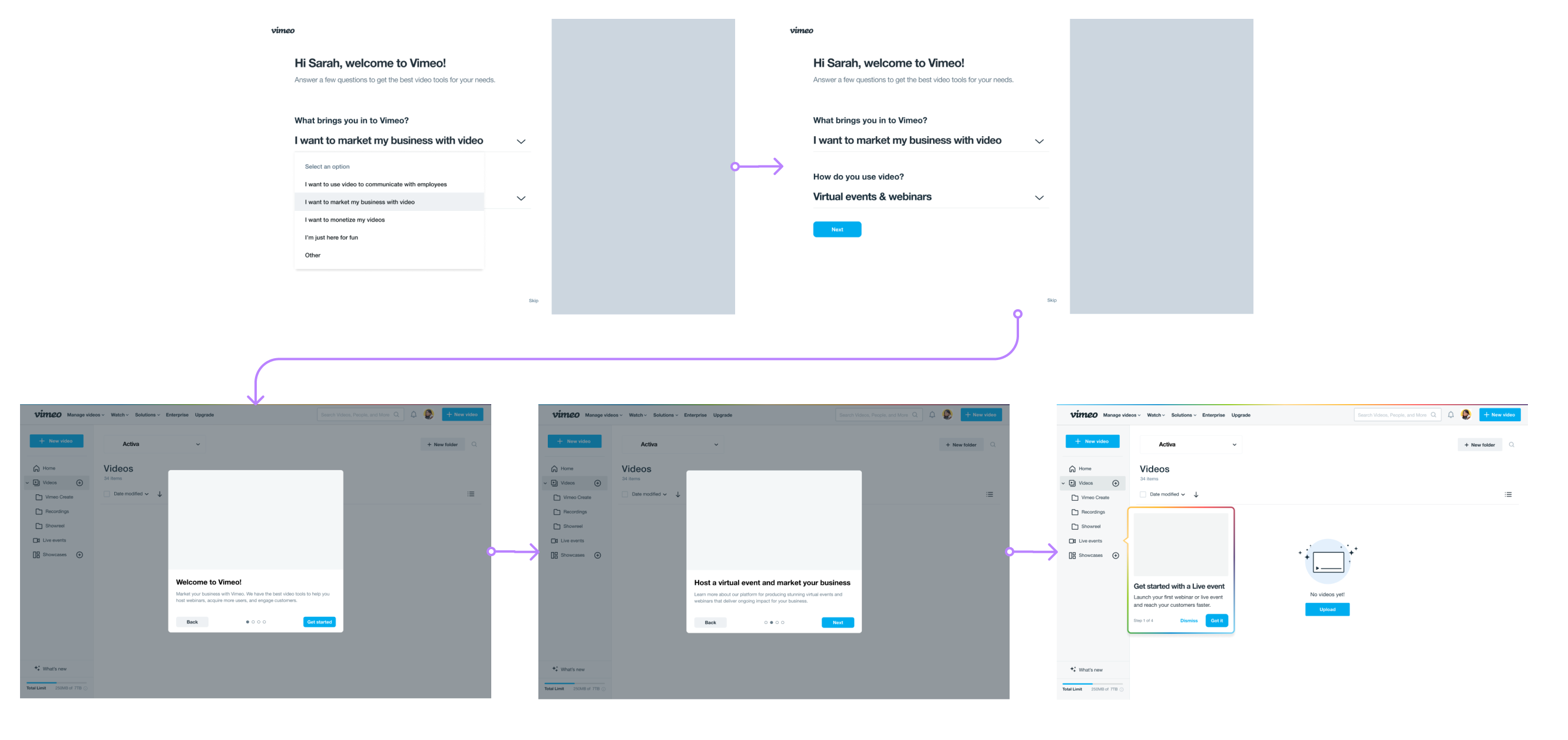
Wireframe #2: Direct entry into homepage → survey → video feature highlight & guided tour

Wireframe #3: Multi-step approach, more personalized feature highlight → feature CTA
challenge
Through feedback from stakeholders, there were concerns about having multiple steps within the onboarding experience and how it would affect the completion rate. From a design perspective, advocating for two specific steps allows for more personalization which may add more value to users.
To resolve conflict, we decided to test our hypotheses.
Conducting user research
In collaboration with UX research, I created a research plan to test our hypotheses. We used the existing survey design as our control and performed cross-ABC testing to identify the best solution forward.
hypothesis #1
Users expect something in return when asked questions on usage of video tools
hypothesis #2
Users found value in Vimeo when they were educated on available video tools that were relevant to help solve their JTBD
hypothesis #3
Users are more likely to have a positive experience of a product when the experience is personalized to their needs
hypothesis #4
Users are more likely to return when they understand value of a product in solving their needs
research insights
1. Input vs. Output
“If I’m being asked to provide information, I expect something in return”.
Actual value > perceived value
2. Personalization = value
Users saw more value in Vimeo’s product when provided with information on various video tools available.
3. Vimeo’s legacy perception
“I thought Vimeo was just an ‘indie’ version of YouTube for video storage”.
Onboarding is the gateway to changing users’ perceptions of Vimeo’s product offering.
3. Higher completion rate
Shorter the onboarding experience, higher the completion rate. “if onboarding is more than four steps, I wont complete it”
Delivering value
Consolidating our findings, I focused on delivering value by maximizing positive user psychology.
Action → Aha moment (education) → Aha moment (relevance)→ Reward
An updated survey design
Content played a vital role in expressing an inviting tone for new users. The use of “Welcome and a users name” creates a feeling excitement and inclusivity. Further, including transparency around the number of questions increased the liklihood of completion. Including visual imagery further ignites excitement and anticipation around the product.


the first aha moment
A personalized experience for each audience segment
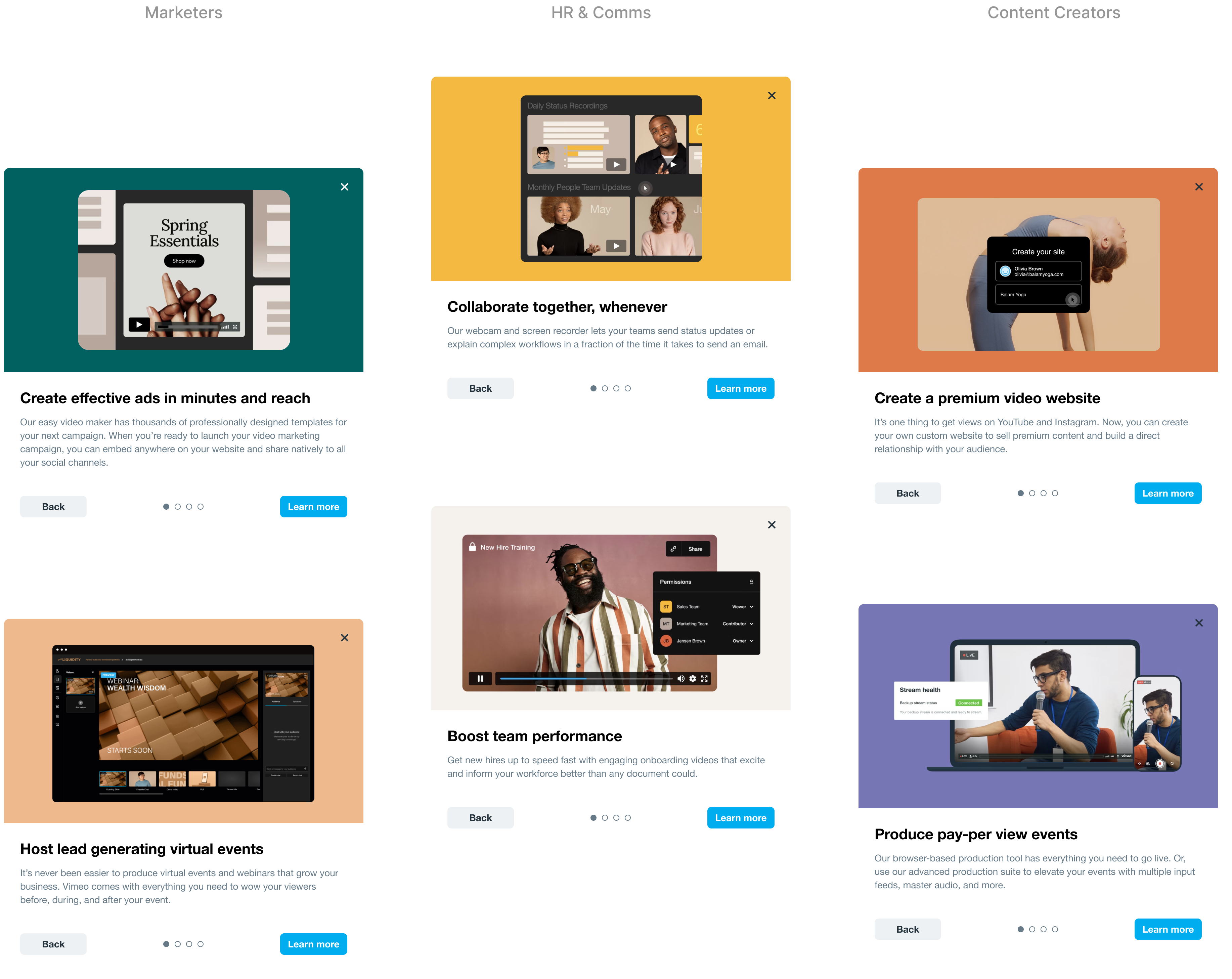
Product growth depends on a user’s first experience. As users entered their use case, we immediately showcased video tools that were relevant to that job. Through content design, we further personalized our message and educated users on Vimeo’s various product offering and their relevance to that segment. For example; the experience for Marketers was different from the experience for HR & Comms.
the second aha moment
Guided feature tour to capture JTBD
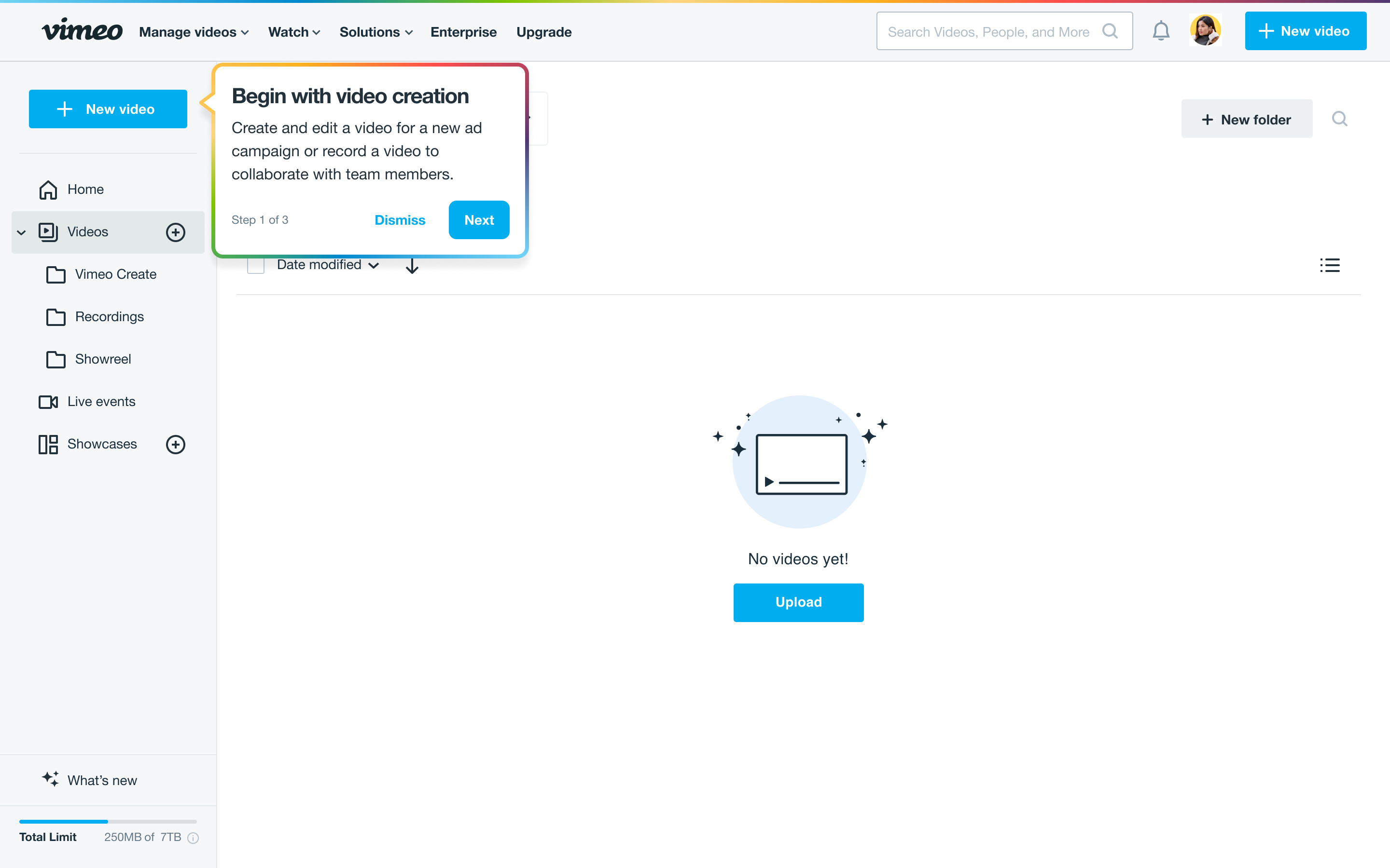
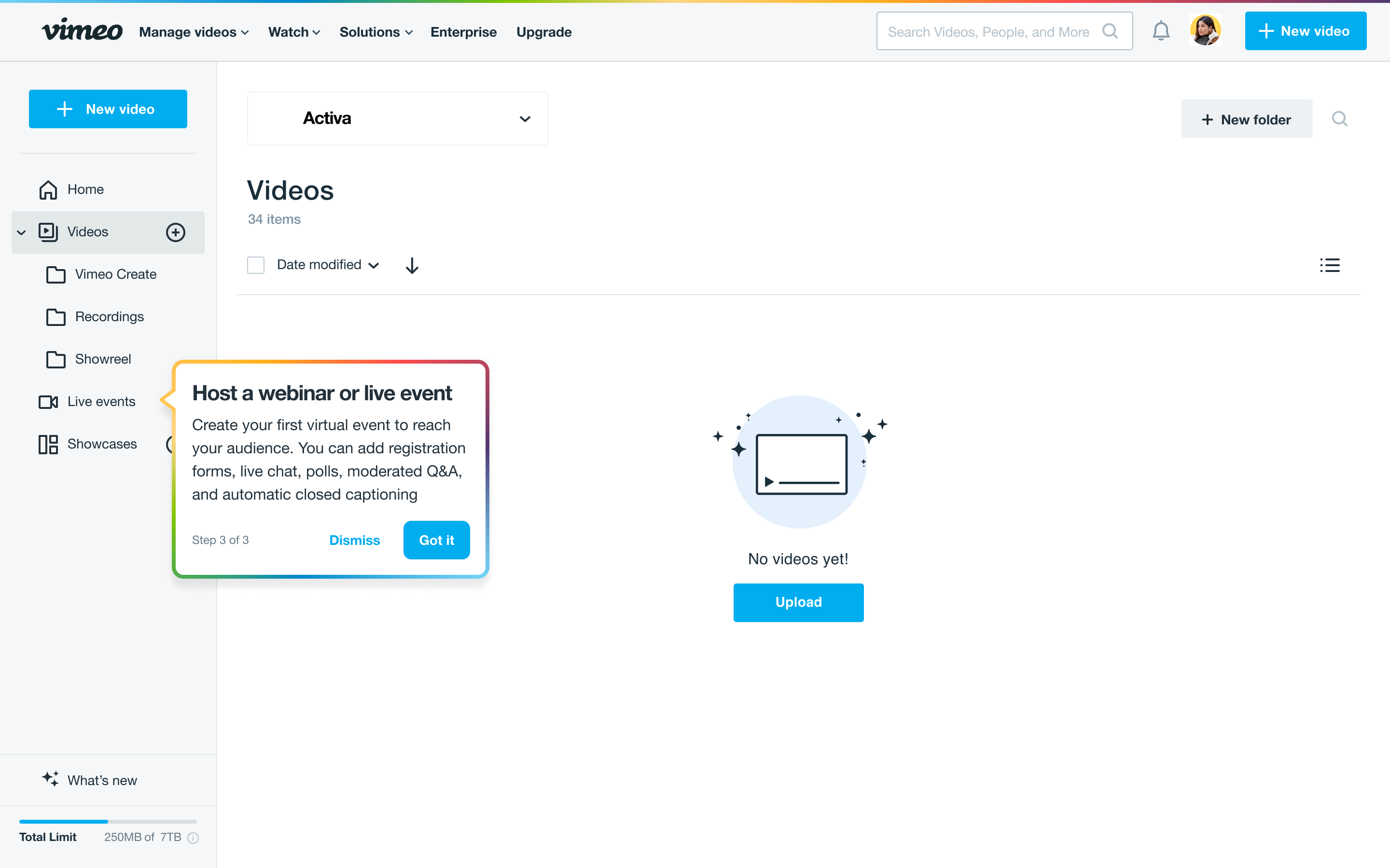
Presenting action items allow users to further get started immediately and understand the value of a feature in completing their job. As a user is guided to the homepage, the product feature tour guides users to specific tools with a CTA on getting started to complete their task.
presenting a case for buy-in with stakeholders
Our PM and engineering resources got reallocated, and as a result, I became a one-person team.
I created a proposal to advocate for improving our user onboarding experience, I wore the hat of a product manager and built our product strategy. I presented the case on the business value of onboarding relevant to Vimeo's OKRs, I showcased the gaps in our current experience and proposed solutions to bridge this gap. To build team structure, I created a mission statement and vision of user onboarding and presented actionable next steps to get us started with a cross-functional design sprint.
RESULTS & IMPACT
Unfortunately, Vimeo went through their first round of layoffs. Resources got reallocated and as a result, we were unable to launch an updated survey design to test the survey completion and engagement rates.
Success, in this case, was defined by identifying an area of product innovation and its relevance to Vimeo's revenue channels.
This project allowed us to advocate for allocating resources to improve the experience at the top of the funnel, thereby increasing our retention rates and driving product-led growth to exceed 100% in Net Revenue Retention.
Challenges
Diving into the unknown: I had no prior knowledge of user onboarding.
I taught myself product-led onboarding in 2 weeks to be equipped for the design challenge.
Breaking down a macro problem into smaller, actionable solutions to evaluate results.
Not deviating too far from the current experience to test conversion rates.
Multiple video tools that operated independently and didn’t connect with each other. Onboarding represented a unique opportunity to connect all of Vimeo’s video tools.
Adapting to constant change in team structure.
One-person team advocating for buy-in with stakeholders.
Lessons learned
Setting a vision for an optimum experience and working back based on constraints.
One of the most interesting projects - diving into first-time user psychology and its impact on long-term success of a product.
Users’ jobs are solution agnostic - you have to dig to the root of the problem that caused them to start looking for a solution in the first place.
Being optimistic - advocating for what’s best for the company.
Understanding business metrics and presenting the numerical value of design is important for getting buy-in from stakeholders.
Fostering design culture through knowledge sharing. I shared some of my learnings from my research with the rest of the team.
 in Sri Lanka